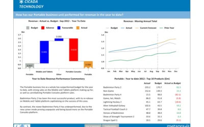
What makes a good Board Report?
FP&A What makes a good Board Report? We have created a set of key principles for companies looking to improve the relevance and usefulness of their Board ReportA company’s board of directors is collectively responsible for leading and directing its affairs in...

Fresh foods sector: understanding profitability
FP&A Fresh foods sector: understanding profitability We look at recent data from the UK retail industry, and at how profitability analysis can help make the most of seasonal variations in demand.Received wisdom may dictate that January is a lean month for food...
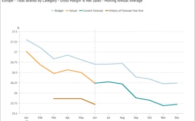
Moving Annual Average – a powerful data transformation
FP&A Moving Annual Average - a powerful data transformation Learn how to use a process to calculating an MATWe can’t use an MAT for a stock type item (like Accounts Receivable or Headcount) or a statistic (such as gross margin % or the £/$ Exchange Rate) because...
Choosing the scale for a graph
FP&A Choosing the scale for a graph The scale for a graph axis can have significant impact on how an audience interprets a message and is an important part of optimising data visualization.The scale selected for a graph axis has a significant impact on how the...
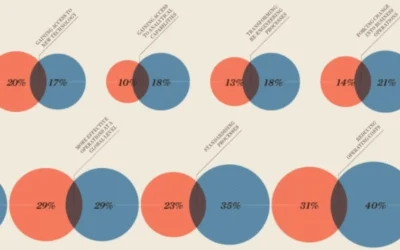
Why bars are better than bubbles
FP&A Why bars are better than bubbles The infographic in Raconteur includes a chart that aims to make quantitative comparisons through the use of circles of different areas.The infographic in the Raconteur supplement distributed with today’s Times includes a chart...

Excel vs. FP&A Platforms: Choosing the Right Vehicle for Your Financial Journey
FP&A Excel vs. FP&A Platforms: Choosing the Right Vehicle for Your Financial Journey Discover why FP&A platforms are like modern off-road vehicles, purpose-built for your data-driven financial expedition.Imagine you're embarking on a cross-country road...