FP&A
A checklist for an effective dashboard
A simple 10 point checklist that we give Metapraxis analysts to use when they create an executive dashboard.

- Does the design and layout of the dashboard conform to current best practice and quality standards?
- Is there an immediate and obvious answer to the ‘so what’ question for every table and chart?
- Are we always using the simplest and most easily understood chart to convey the message?
- Does our commentary add real insight and meaning to the numbers, rather than simply describing them in words?
- Is the insight communicated in a way that can be understood by a manager who is not financially qualified?
- If we have been asked to address business-specific questions in our project brief, are we answering them?
- If we have not, have we come up with our own questions about the business, as if we were the CEO?
- Is the title of each dashboard panel the specific question we are addressing within it?
- Are we addressing the real current issues in this business sector?
- What is the size of the prize and is it big enough to matter?

Abhishek Singh
COO
Abhi joined Metapraxis in 2011 and now leads Operations from our US office. A passionate fan of the Indian cricket team, he also plays cricket at a high level when not watching the game.
FOLLOW US
Latest Posts

Fresh foods sector: understanding profitability
FP&A Fresh foods sector: understanding profitability We look at recent data from the UK retail industry, and at how profitability analysis can help make the most of seasonal variations in demand.Received wisdom may dictate that January is a lean month for food...
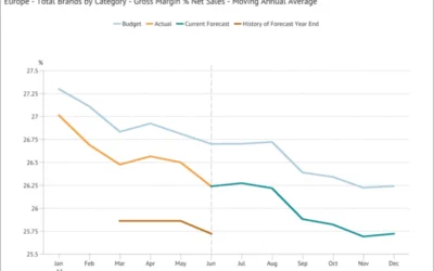
Moving Annual Average – a powerful data transformation
FP&A Moving Annual Average - a powerful data transformation Learn how to use a process to calculating an MATWe can’t use an MAT for a stock type item (like Accounts Receivable or Headcount) or a statistic (such as gross margin % or the £/$ Exchange Rate) because...
Choosing the scale for a graph
FP&A Choosing the scale for a graph The scale for a graph axis can have significant impact on how an audience interprets a message and is an important part of optimising data visualization.The scale selected for a graph axis has a significant impact on how the...