FP&A
Choosing the scale for a graph
The scale for a graph axis can have significant impact on how an audience interprets a message and is an important part of optimising data visualization.

The scale selected for a graph axis has a significant impact on how the audience interprets the message and is an important part of optimising data visualisation. Here we cover the common issues financial planning & analysis professionals face when selecting chart axes and outline best practice guidelines.
Common constraints faced when choosing graph scales
- The range of the tick marks on each scale to include the range of all the data to be plotted
- The desire for the scales to be the same on all graphs within a composite panel for ease of audience interpretation The need for a particular value (such as zero) to be included in a scale
- The need for the chart to appropriately show the key trends in the data (often skewed by anomalies)
- The desire for data points not to appear on the axes
Best practice visualization concept 1 – consider how the graph encodes the data
Different chart types encode data in different ways, understanding how your graph encodes the data is key to selecting the appropriate axis scale. Line graphs and dot charts emphasize the differences between values. However, in bar charts it is the length of the bar representing the absolute value of the data point that is the primary visual display and therefore of most importance. Different graph types subsequently have different principles for selecting scales.For more on selecting the right graph type see Chart Chooser for trends

Abhishek Singh
Global Client Delivery Director
Abhi joined us in 2011 and heads up our Client Delivery Team from our US office. A devoted fan of the Indian cricket team and, when not watching cricket, plays cricket at a high level himself.
FOLLOW US
Best practice visualization concept 2 – always include zero if possible
For bar charts, the axis should always start at zero since it is the length of the bar that is being used to encode the data.In Figure 1.0 the zigzags at the base of the bars are intended to warn the reader that the scale does not include zero. However, the bar lengths are meaningless in this rendition of the graph since they encode the data minus the arbitrary value 34.
Figure 1.0 – scale does not start at zero[/caption]If a bar chart is preferred, it should always include zero as Figure 2.0 shows:

Figure 2.0 – bar graph scale should always start at zero[/caption]For line and dot charts, where appropriate, zero should also be included on the scale. This is to provide consistency with any other graph types featured on the same panel. It also ensures that trends in the data are not exacerbated misleadingly due to magnified scales. However, please see best practice concept 3 for important exceptions.
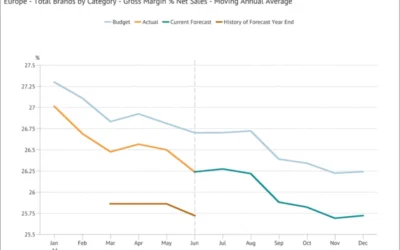
Best practice visualization concept 3 – use as much of the data region as possibleFor line charts, within the constraints above, aim to “use as much of the data region as possible*”. What does this mean? In Figure 3.0 below the space from 0-30% is not utilized, only 15% of the vertical scale is taken up by the data. This wastes space and compromises resolution.

Figure 3.0 – graph does not maximize data region[/caption]In Figure 4.0 the scale has been adjusted to use more of the vertical space, whilst ensuring that the range of tick marks on the vertical scale includes all of the data that has been plotted. This also brings out the trend better, the fluctuation and decline in the metric is easier to interpret than in Figure 3.0.

Figure 4.0 – scale adjusted to use more of the vertical space[/caption]*William S Cleveland, The Elements of Graphich Data, 1985Metapraxis has been at the forefront of data visualization for over 30 years and our research and best practice are integrated into our leading financial analytics platform, Metapraxis Empower.
Latest Posts
What makes a good Board Report?
FP&A What makes a good Board Report? We have created a set of key principles for companies looking to improve the relevance and usefulness of their Board ReportA company’s board of directors is collectively responsible for leading and directing its affairs in...

Fresh foods sector: understanding profitability
FP&A Fresh foods sector: understanding profitability We look at recent data from the UK retail industry, and at how profitability analysis can help make the most of seasonal variations in demand.Received wisdom may dictate that January is a lean month for food...
Moving Annual Average – a powerful data transformation
FP&A Moving Annual Average - a powerful data transformation Learn how to use a process to calculating an MATWe can’t use an MAT for a stock type item (like Accounts Receivable or Headcount) or a statistic (such as gross margin % or the £/$ Exchange Rate) because...