FP&A
Don’t Persist with Excel: Knowing When to Move On
Excel is a powerful tool—no doubt about it. It’s often our go-to for managing data, creating reports, and analysing numbers. However, there comes a point where persisting with Excel becomes counterproductive. It’s a bit like the art of perseverance: knowing when to push through and when to let go.

Recognising Excel’s Limits
Excel is fantastic for small datasets and straightforward tasks, but as complexity grows, so do the risks. Spreadsheets become cumbersome, error-prone, and difficult to maintain. It’s like sticking with an outdated cricket player—loyal, but perhaps not the best choice for winning the game. Moving to more robust data management tools can save time, reduce errors, and provide more insights than a spreadsheet ever could.
When Stubborn Persistence Becomes a Problem
Many businesses persist with Excel simply because it’s familiar. This persistence can lead to issues like data loss, version control problems, and limited scalability. Much like persevering against obstacles, there’s a fine line between pushing Excel to its limits and recognising when it’s no longer serving you. Upgrading to specialised software can be a game-changer. (especially when it integrates with Excel like Empower does).
The Balance: Knowing When to Let Go of Excel
Excel is an excellent tool—until it isn’t. The wisdom lies in recognising when your data management needs have outgrown it. Just as in the art of perseverance, the greatest strength lies not in pushing Excel to do more than it’s designed for but in knowing when to pivot to more sophisticated solutions. Embrace change, and you’ll unlock greater efficiency and insights.
So, don’t persist with Excel when it’s time to evolve. Explore the alternatives, and find the right tools that allow your data to work for you, not against you.

Abhishek Singh
COO
Abhi joined Metapraxis in 2011 and now leads Operations from our US office. A passionate fan of the Indian cricket team, he also plays cricket at a high level when not watching the game.
FOLLOW US
Latest Posts

Fresh foods sector: understanding profitability
FP&A Fresh foods sector: understanding profitability We look at recent data from the UK retail industry, and at how profitability analysis can help make the most of seasonal variations in demand.Received wisdom may dictate that January is a lean month for food...
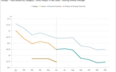
Moving Annual Average – a powerful data transformation
FP&A Moving Annual Average - a powerful data transformation Learn how to use a process to calculating an MATWe can’t use an MAT for a stock type item (like Accounts Receivable or Headcount) or a statistic (such as gross margin % or the £/$ Exchange Rate) because...
Choosing the scale for a graph
FP&A Choosing the scale for a graph The scale for a graph axis can have significant impact on how an audience interprets a message and is an important part of optimising data visualization.The scale selected for a graph axis has a significant impact on how the...