FP&A
Today’s misleading infographic
The Raconteur supplement in the Times contains a large centre spread infographic entitled “How UK compares to European rivals”.The supplement in today’s Times newspaper published by Raconteur contains a large centre spread infographic entitled “How UK compares to European rivals”. The right hand side of this infographic contains the graph below, which is entitled “Manufacturing Contribution to EU-4 Mid Market”.
It is clear from the flags at the base of the graph that each of the four bars represents one of the four EU Big 4 (Germany, UK, Italy and France). However, it is much less clear what the four segments within each of the bars mean. They are described in the legend as “Firms”, “Revenue”, “Employees” and “GDP” and there is a percentage value within each segment. Unfortunately, the percentages within the bars do not add up to 100% (and neither do the percentages in segments of the same colour).My interpretation is of the chart is that the values for each country represent (a) the percentage that manufacturing firms represent of mid market firms, (b) the percentage of mid market revenues that manufacturing firms represent, (c) the percentage of employees in mid market firms who work in manufacturing and (d) the percentage of mid market GDP represented by the manufacturing sector.More importantly, this graphic completely violates the key principle of the stacked bar chart, namely that the total bar itself should represent something meaningful. It appears that the the designer of the infographic has simply left a tall thin space on the right of the picture which needed some content and a quick way of creating a tall thin chart was to stack four sets of unrelated data together.

Latest Posts

Fresh foods sector: understanding profitability
FP&A Fresh foods sector: understanding profitability We look at recent data from the UK retail industry, and at how profitability analysis can help make the most of seasonal variations in demand.Received wisdom may dictate that January is a lean month for food...
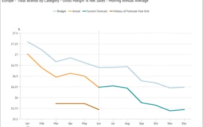
Moving Annual Average – a powerful data transformation
FP&A Moving Annual Average - a powerful data transformation Learn how to use a process to calculating an MATWe can’t use an MAT for a stock type item (like Accounts Receivable or Headcount) or a statistic (such as gross margin % or the £/$ Exchange Rate) because...
Choosing the scale for a graph
FP&A Choosing the scale for a graph The scale for a graph axis can have significant impact on how an audience interprets a message and is an important part of optimising data visualization.The scale selected for a graph axis has a significant impact on how the...