FP&A
Today’s misleading infographic
The Raconteur supplement in the Times contains a large centre spread infographic entitled “How UK compares to European rivals”.The supplement in today’s Times newspaper published by Raconteur contains a large centre spread infographic entitled “How UK compares to European rivals”. The right hand side of this infographic contains the graph below, which is entitled “Manufacturing Contribution to EU-4 Mid Market”.
It is clear from the flags at the base of the graph that each of the four bars represents one of the four EU Big 4 (Germany, UK, Italy and France). However, it is much less clear what the four segments within each of the bars mean. They are described in the legend as “Firms”, “Revenue”, “Employees” and “GDP” and there is a percentage value within each segment. Unfortunately, the percentages within the bars do not add up to 100% (and neither do the percentages in segments of the same colour).My interpretation is of the chart is that the values for each country represent (a) the percentage that manufacturing firms represent of mid market firms, (b) the percentage of mid market revenues that manufacturing firms represent, (c) the percentage of employees in mid market firms who work in manufacturing and (d) the percentage of mid market GDP represented by the manufacturing sector.More importantly, this graphic completely violates the key principle of the stacked bar chart, namely that the total bar itself should represent something meaningful. It appears that the the designer of the infographic has simply left a tall thin space on the right of the picture which needed some content and a quick way of creating a tall thin chart was to stack four sets of unrelated data together.

Latest Posts
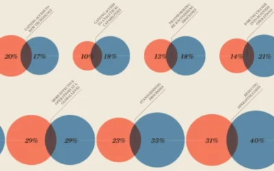
Why bars are better than bubbles
FP&A Why bars are better than bubbles The infographic in Raconteur includes a chart that aims to make quantitative comparisons through the use of circles of different areas.The infographic in the Raconteur supplement distributed with today’s Times includes a chart...

Excel vs. FP&A Platforms: Choosing the Right Vehicle for Your Financial Journey
FP&A Excel vs. FP&A Platforms: Choosing the Right Vehicle for Your Financial Journey Discover why FP&A platforms are like modern off-road vehicles, purpose-built for your data-driven financial expedition.Imagine you're embarking on a cross-country road...

Revolutionising FP&A with the Intelligence Processing System (IPS)
FP&A Revolutionising FP&A with the Intelligence Processing System (IPS) Experience the future of FP&A with the Intelligence Processing System (IPS). Revolutionize your FP&A, leaving behind Excel's limitations. Welcome an era of data-driven...