FP&A
Why bars are better than bubbles
The infographic in Raconteur includes a chart that aims to make quantitative comparisons through the use of circles of different areas.

The infographic in the Raconteur supplement distributed with today’s Times includes a chart that aims to make quantitative comparisons through the use of circles of different areas.There are two sets of bubbles, denoted by the pink and blue colours which, according to the legend, represent “IT Outsourcing” and “Business Process Outsourcing”. The bubbles in each pair overlap, and the colour of the intersection is represented by the mix of the two shades. The intersections are labelled with the names of each measure.
FOLLOW US
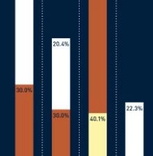
At first sight, I thought that each pair of bubbles was a Venn diagram and that the area of overlap represented some meaningful data. However, on closer inspection I realised that the intersection had no meaning whatever and was simply a way of bunching up the bubbles so that they fit within the space available.Each bubble is labelled with a percentage, and it appears that the area of the bubble encodes that value. The problem with this method of encoding data is that the human brain is not very good at judging the relative areas of circles.William Cleveland and Robert McGill conducted empirical research on graphs and the human visual system that was published in the journal “Science” in 1985. They discovered a rank order for methods of encoding quantitative data in terms of the accuracy of perception of the values by their subjects. The most accurately perceived method of encoding data was something they described as “position along a common scale”, which is the method used in a bar chart. They found area to be perceived much less accurately, being ranked only five out of seven in the various methods of encoding data that they studied.To illustrate this, I took the data from the first line of pink bubbles (called strategic measures in the infographic) and created two alternative visualizations in Excel. The first encodes the data within bubbles, the areas of which are proportional to the percentages given. This creates a chart similar to the one in the infographic:

The second visualization I made was this bar chart:

Which chart do you think is more effective in enabling you to compare the values?
Latest Posts

FP&A Best Practices
EBOOKS FP&A Best Practices Unlock the potential of your FP&A team with these actionable strategies to elevate performance, leverage meaningful data, align with strategy, and drive success in today's dynamic business landscapeREAD THE FREE EBOOK HERE eBook: 18...

A checklist for an effective dashboard
FP&A A checklist for an effective dashboard A simple 10 point checklist that we give Metapraxis analysts to use when they create an executive dashboard. Does the design and layout of the dashboard conform to current best practice and quality standards? Is there an...
Today’s misleading infographic
FP&A Today's misleading infographic The Raconteur supplement in the Times contains a large centre spread infographic entitled “How UK compares to European rivals”.The supplement in today’s Times newspaper published by Raconteur contains a large centre spread...